
Let’s look at line readings in the Condmaster Ruby. I have logged into the software through a remote desktop connection, and the first part I want to show you is the signal quality evaluation for a flotation application.
I click on the online system overview. I activated the signal quality assessment some time ago, so I already have a lot of data. I click on “signal quality” to view it.
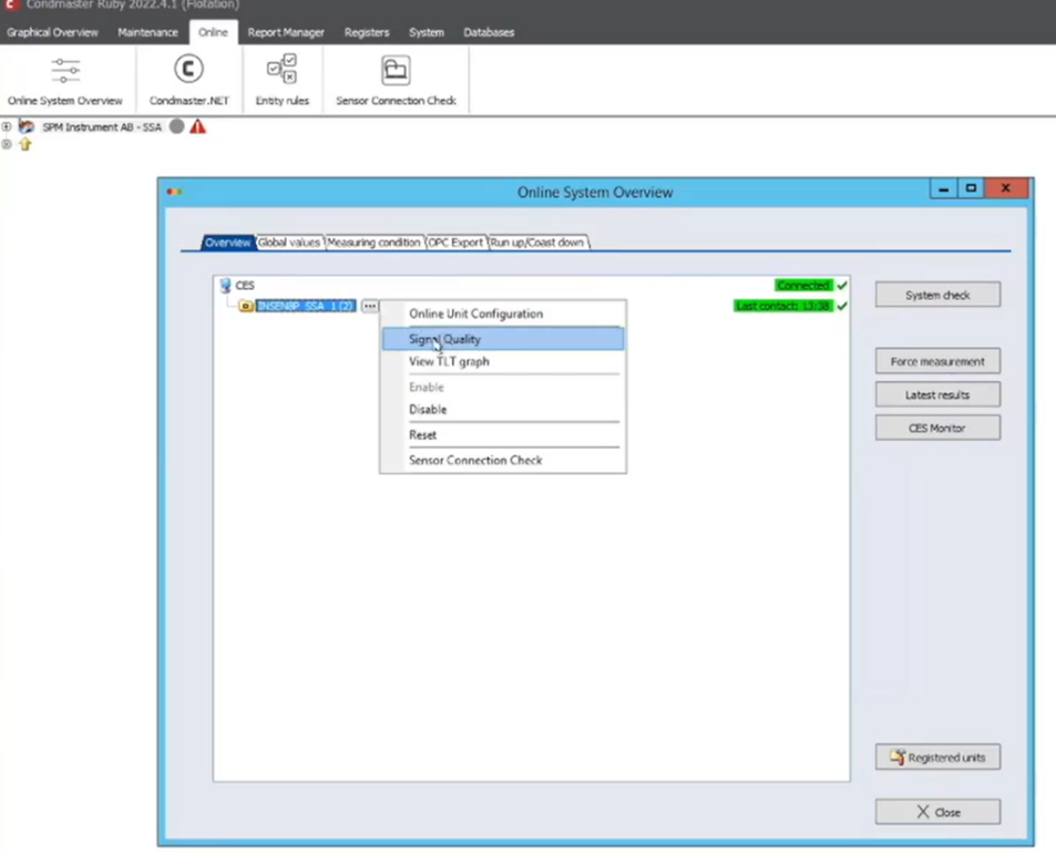
Figure 1: Click on “signal quality” to view the data
In this small database, I have only three sensors. In some cases, there are 45,000 measuring points to one database, so quality assessment is especially useful in that case.
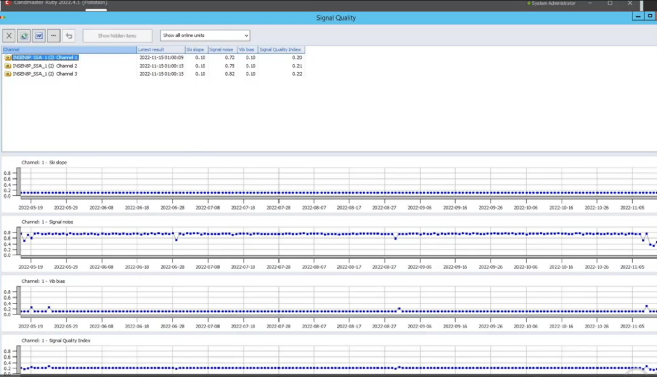
Figure 2: Readings from three sensors
Let’s talk about the columns at the top, starting with “Latest result.” When I activated the signal quality assessment, I told the system to automatically assess the signal quality once per day. It is possible to set it to other intervals, such as once per hour, once per half hour, once per week, etc. Once per day is the default setting, which I have been using with good results.
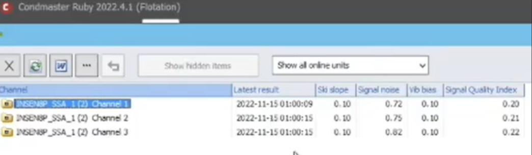
Figure 3: The columns provide information about the readings
Our system is sending out some measuring assignments, measuring tasks automatically in the background, so you do not need to do this manually. It is sending out a normal velocity assignment, a measuring task to search for ski slope content, indicated in the next column.
If the results contain a lot of ski slopes, that is a bad sign. As most of you know, a ski slope can be a sign of issues such as EMC problems, cables with a lot of moisture, and impacting.
The value in the ski slope column is a health score. A low health score is good, and a high health score is bad. This does not seem logical, but it is the standard in the industry. A health score of 0.1, as seen in the signal readings above, is good. It means that these three channels do not contain any ski slopes at all.
The health score is normally shown as a value between 0 and 1, so a value close to 0 is very good, and 1 means there is a huge gap between the desired behavior and what is happening.
The next column, “signal noise,” is the ratio of the useful signals, such as gear mesh, bearing noise, and unbalance, compared to the noise floor in the system. Again, a value close to 1 is bad, and a value close to 0 is very good.
The values in Channels 1 and 2 are high because they are measuring on a flotation in the tank itself. We are looking for bubbles in the flotation device, and that is, per definition, a lot of noise. We have some useful signals in the spectrums, but not too many since they are noisy.
The next column, “vib bias,” is the stability of the bias value over a long time. There can be significant variation in the bias values if there are temperature variations, moisture in the cables, or impacting. In this case, a value of 0.1 means these values are very stable over time.
In summary, these readings show good results for the ski slopes and vib bias, but somewhat high noise. If the sensor is not measuring anything useful, the signal noise value will be close to 1. If you have EMC-related problems, the bias value may be good, but the ski slope content may be very high. You will see that you have issues with the signal quality.
In this software, we have added a weight factor. The ski slope value is multiplied by 3 because we consider ski slopes to be the most serious problem. The signal noise is only multiplied by 1, as that is a lower weight factor. The vib bias value is multiplied by 2.
Add the factors together, and you have one result that is normalized to a factor between 0.1 and 1, shown in the “signal quality index” column. The default weight factors are 3, 2, and 1 for ski slope, vib bias, and noise, but you can change them in the settings.
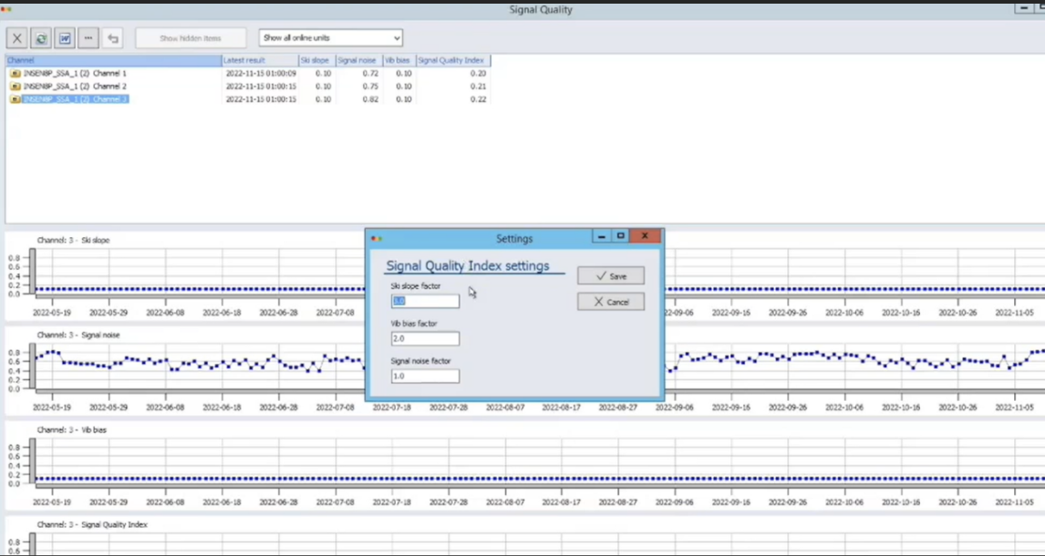
Figure 4: Change the weight factors in the settings
If you have hundreds of sensors, it is convenient to sort them according to signal quality index, from worst to best. In our case, Channel 3 has the worst score. By clicking on the W, you can also write the report in Word, where you can study the channels further. Perhaps you have some doubtful channels or incorrectly mounted sensors.
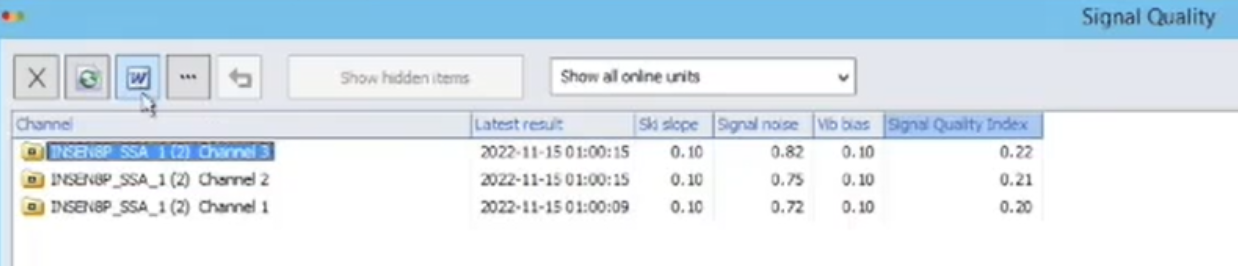
Figure 5: Click on the W at the top to create a report in Word
