
A shaking, or vibrating, screen is a common piece of machinery in mineral processing and mining operations as well as oil and gas. In this case, it is used to sort fractions of ore. Here is a diagram of it from above.

Figure 1: Diagram of a vibrating screen in the Condmaster Ruby software
The ore is flowing in the direction of the arrow, and the screen is shaking quite violently. There is significant imbalance, creating an elliptical movement. The frame is supported by springs, which are actually vertical but shown sideways in the diagram.
There is a triaxial sensor in each corner measuring the elliptical movement of the corners. In this application, you want to see elliptical movement that is similar in each corner; otherwise, you lose efficiency in production.
Using the Condmaster Ruby, you can designate colors for certain health scores. I have colored the left feed red and the right discharge orange.

Figure 2: Use colors to indicate health scores
I put this component in learning mode some time ago, and I have values for the normal behavior of the machine, with the average values and standard deviation. The red color at the left feed corner indicates that the latest values are deviating significantly from normal behavior, and there are some issues. The orange color at the right discharge corner indicates that these values are also deviating from normal behavior.
If I want to collect data to create a baseline, I can put the whole machine in learning mode. To do this, I select baseline manager under the maintenance tab.

Figure 3: Select baseline manager
I have a number of options: left feed, left discharge, right feed, and right discharge as well as previously made calculations on the right. I can choose, for example, right feed Y TSA—TSA stands for time synchronization. If I want to put this assignment into learning mode, I can do that on the right side of the screen. The training period will be started for this assignment only.

Figure 4: Click “start training period” to put an assignment in learning mode
A window will open, and I can choose to collect the data automatically for 30 days. After that, the system will be fully taught, and the data recorded will be the baseline. Alternatively, I can choose to continue the training period until a certain number of results have been collected. You can choose depending on how stable your machine is. Click start, and the training mode begins.

Figure 5: Select the limits of the training period
You can choose to train on single assignments, or you can put the whole machine or a whole database in training mode. This will automatically collect for several different measuring tasks, and you establish the baselines for all of these tasks.
In this case, I measure this vibrating screen once per hour and need 100 results for the machine to learn normal behavior. On the right of the screen, I can see that the progress is 0% because I have just started the process. By clicking on the three dots, I can pause or stop the training mode, among other options.

Figure 6: Options to pause or stop the training period
When you have finished the training period, go to the operating mode and compare the new readings to the taught baseline behavior. If there is deviation, the color, representing the health score, will tell you how much deviation there is.
You can also navigate to the tree structure to view the assignment. The right feed Y TSA is now in learning mode, and it will need some time to collect.
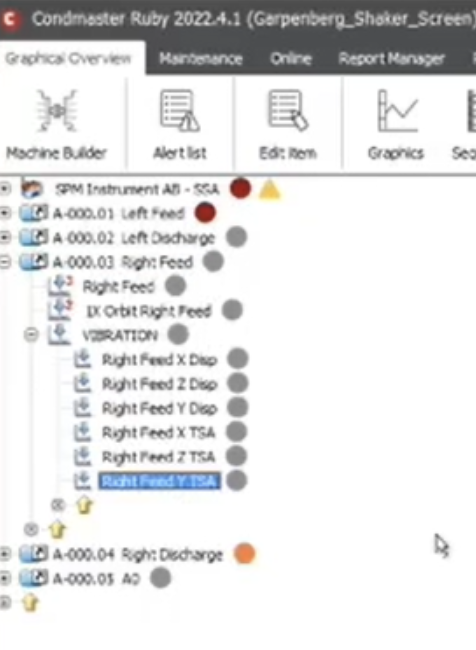
Figure 7: You can view your assignments using the tree structure
Meanwhile, I can view historical data by clicking on “graphics” at the top. It can be viewed in RPM or LRMS. This vibrating screen has been in operation for some time, and you can see gaps from where it was standing still because a different vibrating screen was in use.

Figure 8: Viewing the vibrating screen in LRMS
In our system, we do not measure the machine when it’s not in use, which is why the gaps are there. If I don’t want to see the gaps, I can remove them.

Figure 9: Select measuring protocol to remove gaps
Removing the gaps makes the data easier to read. The data goes back to February, so there is quite a lot. It is possible to select a portion of the historical data and use it as a baseline instead.

Figure 10: Select a portion of historical data
Then, I add that data to the baseline.
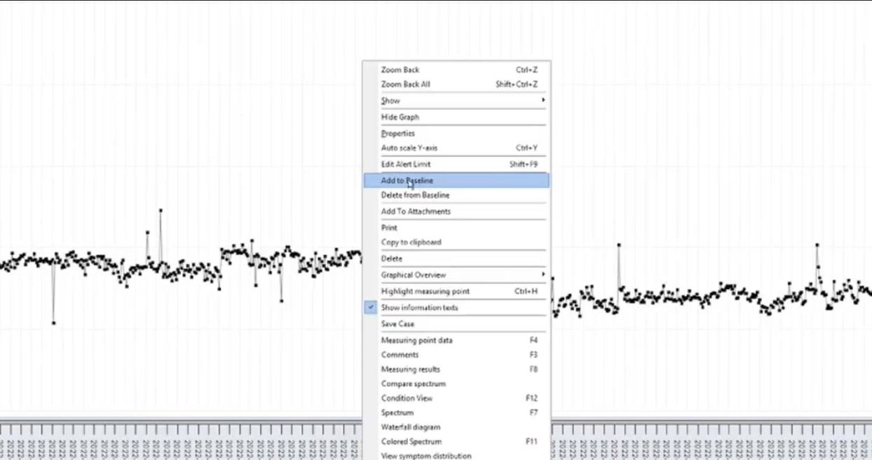
Figure 11: Add historical data to the baseline
The readings that are included in the training period will be shown in blue. Now, I have a baseline for this LRMS assignment.
I can also click on “measuring results” to open a new window.

Figure 12: Click on “measuring results”
Remember, I used historical data for the baseline. If I scroll down, I will see rows marked with “B” because they are part of the baseline data. I can also select additional rows and add them to the baseline data by selecting the “B” at the top of the window.

Figure 13: Select rows and click on “B” to add them to the baseline data
In short, to obtain baseline data, you can either use historical data or put the machine into learning mode. This is a very versatile system. You can then compare new data to the baseline data to check the health of your machine.
